
7 Design Tweaks to Make Your Proposal Credible and Trustworthy

When working on a proposal, so much consideration goes into how to phrase your offering, what to include as examples, where to place your pitch, and how to reduce jargon so the reader better understands your solution. With so much focus on the actual words on the page, it can be easy to overlook the design of your proposal. While most companies have a modern, updated template, if yours is not, it can hurt your company’s credibility and authority no matter how well you write your content.
To avoid getting stuck in the “no” pile, follow these simple design tweaks to create a proposal design that helps your company stand out in the best way.
Use Modern Color Conventions
Before a buyer reads a single word, they will first see the overall color scheme of your proposal. Most proposals start with a well-designed (and often colorful) cover page since it has little text. Beyond the cover page, you can use color throughout your proposal for emphasis, to add brand personality, and to add a bit of breathing room for readers.
When choosing colors for your proposal, select no more than three. Those three colors will be:
1 core color to use for headings, some callouts, and contrast
1 base color for your text (typically black, dark gray, or dark blue)
1 color for emphasis, often a more noticeable color, like red or yellow, depending on your brand colors
With these three colors, you will be able to create a cohesive and well-designed proposal without having so many colors that make it overwhelming.
Incorporate Images
An easy way to make your proposal more credible is to show images where possible. Images should be placed alongside content where you reference them or speak about that image. For example, an image of your company headquarters might go in a company history section or in a section where you mention on-site quarterly meetings with the customer.
A great way to make your proposal feel more tangible is to show what the customer will receive when they work with you. For example, if you sell products, include product photos throughout the proposal. For service-based projects, include photos of your team who will work with the customer or examples of possible deliverables they will receive. The more real you can make your offering seem, the more confident the customer will be in purchasing from you.
Add graphics
Where images are photographs, graphics are designed visual elements. Graphics are a great way to break up the text and make your proposal more visual. You might use graphics to highlight key themes. For example, if one of your themes is your extensive industry experience, you might design a graphic that highlights some of your biggest projects or client wins.
Graphics are also a great way to show complicated processes or anything that might be easier to understand with a visual. For example, graphics are perfect for showing an implementation process or how different aspects of your solution work together. If you think the text is confusing, adding a graphic might help make it easier for the buyer to understand. As a bonus, they’re more likely to look at graphics first, so including more will only help your proposal.
Use Standard Fonts
While different visual elements, like color, images, and graphics, can help make your proposal more interesting and visually appealing, your proposal is still a text-based document. That means you need to pay close attention to the design of your text so it’s easy to read for evaluators.
If you’re responding to RFPs, some of them will dictate what type of font (or typeface) to use in your proposal. When not specified, it’s best to stick with a standard font that everyone is familiar with so it’s easy to read. The most common proposal fonts are Arial (or some variation, such as Arial Narrow) or Times New Roman. They may not be the most glamorous or trendy fonts, but by choosing these you can rest assured that buyers are focused on what you’re saying rather than trying to understand a new font they haven’t seen before. Save the creativity for the sections above, and let your text speak for itself.
Start Sections on New Page
A very simple way to make your proposal a little clearer is to start each section on a new page. For example, it may be tempting to have Section 4 start in the middle of the page if Section 3 only had one paragraph on the page, but if you start on a new page, it makes it easy to find the start of the section. Some companies like to separate the proposal when reviewing, and starting your sections on a new page makes this easier for evaluators (while also ensuring that the start or end of a section isn’t lost).
If you have a page limit, however, sometimes you need that extra space to answer the questions. In those cases, the section starts are often the first thing we shorten to make sure there is enough space to create a thoughtful proposal.
Use In-Document Hyperlinks
The goal with proposal design is to make your document easy to navigate. One way you can do that is to add hyperlinks throughout your proposal when you reference other sections. This is most common in the Table of Contents, but you can also do this anywhere in your proposal. For example, if you mention a particular case study in one section but the case study doesn’t appear for ten pages, link to the case study so they can jump straight to it.
Show Customer Examples (if applicable)
It’s very common to include references or short case studies in proposals to establish credibility. You can take this a step further by including visuals of past customers. For example, a construction company might include a photo of a finished project. A product company might show a customer using their product. A service company can show their team onsite presenting the final solution to the client. If you don’t have any of these photos, one option is to incorporate the customer logos into your proposal or design a quote from the customer to be more visual.
Next Steps for Proposal Design
While evaluators will determine an award based on many factors, you want to use your proposal design to make it as easy as possible for them to review your proposal. These small tweaks can help make your proposal easier to navigate while also highlighting some of the key reasons the client should work with you.
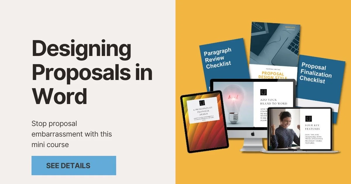
If you need help putting any of this into practice, check out our Designing Proposals in Word course to learn more about proposal design and how to design your proposal in Microsoft Word.